
Creating accessible Power Apps is not only a requirement that all developers should meet, but it’s also easy and approachable. Here are the top tips for making sure your Power App is accessible and usable for your entire audience. The following quick tips are not an exhaustive treatment of accessibility in Power Apps. It’s important to stay up-to-date with accessibility standards, since the tools and the standards, evolve very quickly.
Use Plain Language for Screen Names
While most of the elements and controls in Power Apps do not require accessible titles, the screen names most certainly do. Screen readers generally interpret and read the screen names. This means you should use proper casing and plain language (with spaces, not underscores or dashes) to name your canvas app screens. According to the PowerApps Canvas App Coding Standards and Guidelines:
"...screen names are read aloud by screen readers, which are needed for users who have vision accessibility needs. Therefore, it’s imperative that you use plain language to name your screens, and that the names include spaces and no abbreviations."
PowerApps Canvas App Coding Standards and Guidelines White Paper
Always Populate AccessibleLabel
The AccessibleLabel property is available for most controls and elements within canvas apps. This label is akin to alt text labels in web design. The AccessibleLabel property should describe the function of the control. If the control collects data or input, it should describe the data it is collecting. This includes describing controls with multiple choices such as radio controls or drop-downs. In addition, according to Microsoft’s documentation, images, icons and shapes will not appear to screen readers if this property is not set.
Set and Maintain TabIndex
The TabIndex properties of a control (1) determine if a control is a step in keyboard navigation and (2) define the order in which the element is accessed in navigation. Traditionally, navigation is accomplished by clicking the [tab] key to progress from step to step. However, this is used by screen readers as well to determine reading and entry order. It’s important to note, however that screen reader use of TabIndex can vary, and that Microsoft indicates this should be used for keyboard navigation purposes only (see the next tip).
App Structure
Because Canvas Apps can be arranged in virtually any way a developer can imagine, it poses a significant challenge for screen readers. One might think TabIndex does all of the heavy lifting – but screen readers are attempting to interpret and present the entire screen, not just the tabbed input fields. The position and ordering of controls are used to determine the order of elements and how screen readers operate. The order of controls is determined from top to bottom (Y) and left to right (X). So, a good (oversimplified) rule of thumb is to design your app as if you were developing a book layout or creating a standard form.
Use Containers
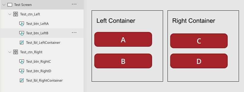
Because a screen reader will read from top to bottom and left to right, you can imagine issues with controls grouped visually in a column. To avoid issues, use containers to group controls. Screen readers will read the first container from left to right and its contents before moving to the next container (see the example below). If you lay out your screen without containers a screen reader would read the header “Left Container”, then “Right Container”, “Button A” then “Button C”, and so on…
Use the Label Role Property
As with web design, the use of headings is a critical navigation cue for screen readers. Since headings are not a specific element in Power Apps, designers must use the role property in labels. Enter the titles of “Heading 1”, “Heading 2” etc… to give the labels meaning for screen readers.
Do Not Use Labels for Navigation or Actions
Use buttons for navigation, actions, and interactivity versus labels. While using a label is more straightforward in many cases – especially if you wish to recreate a traditional web link metaphor – it is problematic for screen readers. Use a button for actions and navigation. In general, use buttons whenever you have interactive text. Buttons can be styled to look like regular text and can meet your design goal while maintaining accessibility.
Know the Limits
Canvas Apps have some notable limitations as far as accessibility is concerned. Several elements such as pop-up dialogs, overlapping elements, and galleries that are fashioned as tables (a common approach). Please review and stay up-to-date with Microsoft’s published Power Apps Accessibility Limitations.