
When I decided to begin writing about and sharing my Power Platform experiences, I wanted to be certain I covered topics and areas that were not covered exhaustively elsewhere. When developing applications and progressing through different learning modules – a topic that was not covered in depth was how to name and organize your applications. Frankly, Microsoft’s Power Platform will allow you to name screens and elements whatever you’d like. You can even change most names and titles without breaking your application. However, if you begin developing complex applications with multiple screens, connectors, and data sources, it becomes critical to have a consistent set of naming conventions to make your application maintainable. In 2018, Microsoft developed a white paper – Power Apps Coding Standards and Guidelines which directly addressed naming conventions within it. Those conventions mirror traditional coding standards, and were aimed at the enterprise.
The following conventions and approaches are my own and were developed through my experience using the Power Platform. The conventions I put forward are designed to be readable, easily searched and recalled, and easily identified – in terms of their function and element type.
Screen Organization and Naming
As put forward in the Standards and Guidelines, using plain language for the names of the screens is critical. A critical reason for this is not only for readability and clarity – but because these names are employed by screen readers and other assistive technologies. Screen names should use proper case and not rely on underscores or dashes. The Standards and Guidelines also indicate you should append each name with ‘Screen’ for clarity, especially if any of your controls may share a name.
For the sake of clarity and ease of organization, the naming conventions I suggest adhere to this standard (of course). To lend some additional clarity to structure, I also suggest that screens be grouped and named aptly so that like areas or activities are adjacent. For example, in an application for course management, I had a series of different activities associated with different roles. My naming convention looked like the following using an area – description – “Screen” naming convention.
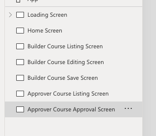
Using the home screen as the main menu, is a preferred convention according to the Standards and Guidelines, and the example applications within Power Apps also uses “Home Screen” traditionally. I use “Loading Screen” or “Landing Screen” when I have a screen that preloads variables or uses a control with conditional navigation. When developing screen names, you are advised not to repeat or use control names or function names you may use elsewhere in the application.
Element / Control Type Coding
The element or control types should use a standard set of abbreviations. As the white paper suggests, using a three-letter code is sensible and consistent. Most of the following adhere to the white paper, with some elements added that were not present at the time.
| Control | Abbreviation |
| Button | btn |
| Camera | cam |
| Card | crd |
| Check Box | chk |
| Combo Box | cbx |
| Date Picker | dte |
| Drop Down | drp |
| Form | frm |
| Gallery | gly |
| HTML Text | htm |
| Icon | icn |
| Image | img |
| Label | lbl |
| List Box | lst |
| Pen Input | pen |
| Radio Group | rad |
| Rich Text | rte |
| Shape – General | shp |
| Shape – Header | hdr |
| Table | tbl |
| Text Field | txt |
| Timer | tmr |
Control Names
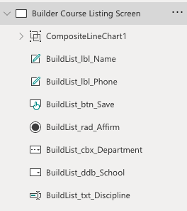
Most advice given for control names tends to be similar, with some minor variation in the order of the descriptors or the specific abbreviations uses to identify the type of element. I suggest and prefer a screen-element/control-descriptor structure since it makes it infinitely easier to call up controls and elements. This is especially useful when working with a larger number of screens and if you are using elements across different screens. For example, on the Builder Course Listing Screen, I would use a one word page abbreviation, the element used, and the descriptor.
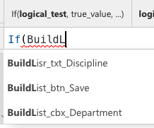
My reason for this slight adjustment to the conventional approach is that you can easily call up elements based on the page or area. Most suggestions, including those within the Standards and Guidelines, call for the element first. If you have a complex application with hundreds of text fields, beginning your formula by typing txt will yield a large number of items, which may not be ideally ordered in the results, whereas filtering by screen first, can help you more quickly pare down your options.
Accessibility and Power Apps
It’s important to stay apprised of how elements and their names or titles are interpreted by screen readers and other accessibility tools. While the screen names are read by screen readers, many of the behind-the-scenes elements are not. However, that may change with added functionality and as the platform evolves. At minimum, you should always be certain to add accessible text descriptions to your elements by editing the Accessible Text fields. In addition, creating a tab order by editing and maintaining the TabIndex for your elements is critical for accessible navigation. Finally, to be assured your applications are as accessible as possible, you should routinely use the accessibility checking feature in the App Checker.